3 Visualizations
The first visualization we wanted to look at from our data was to see which candidates won each of the different counties in Texas and the margin of victory held in each county.
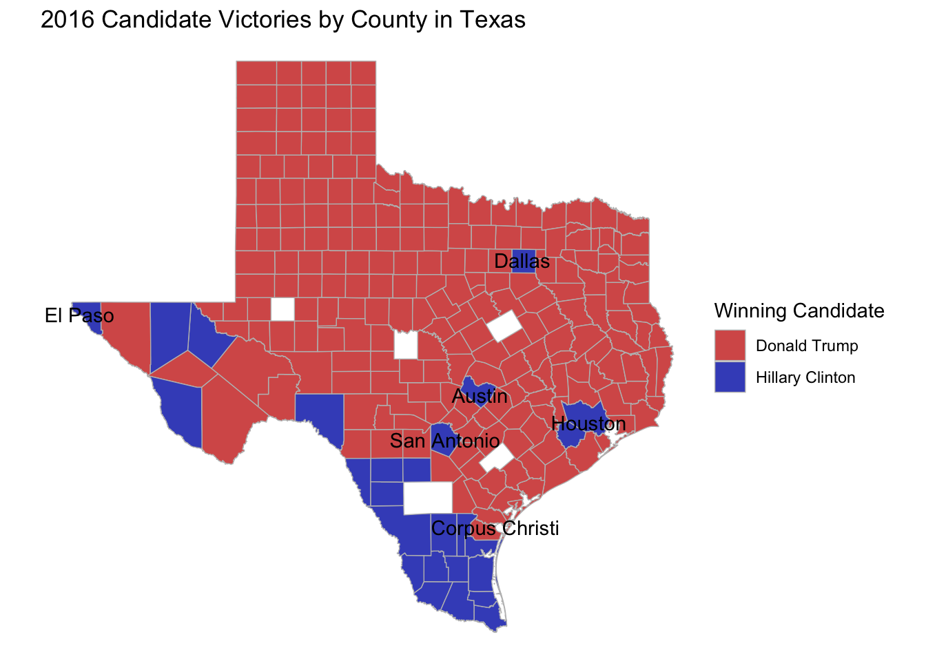
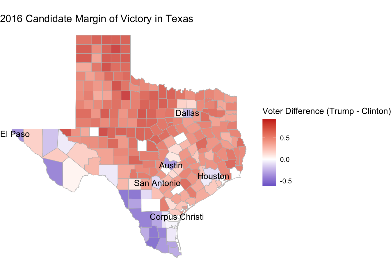
As you can see, many of the counties voted in favor of Republican Donald Trump, which is not a surprise seeing that Texas as a state has leaned Republican in every Presidential election since 1976 when Jimmy Carter won there. However, what we do notice is that around metropolitan/city centers, more people voted for Clinton, but more surprisingly, many along the Texas-Mexico border also voted in favor of Hillary Clinton. These counties became a focus for us as we began to look deeper into the results of the election. (Also there are counties on these maps that are white and that is because these counties did not have enough data in the census for us to include them in our analysis.)
Next, we wanted to look at demographic data across Texas so that we can gain more of an understanding of where certain demographics are located within the state.
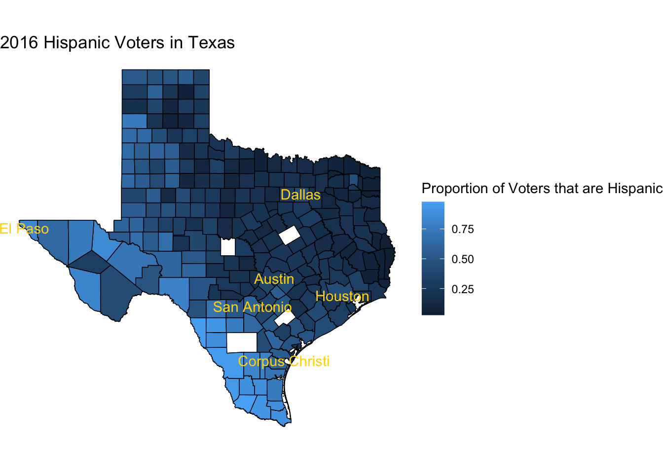
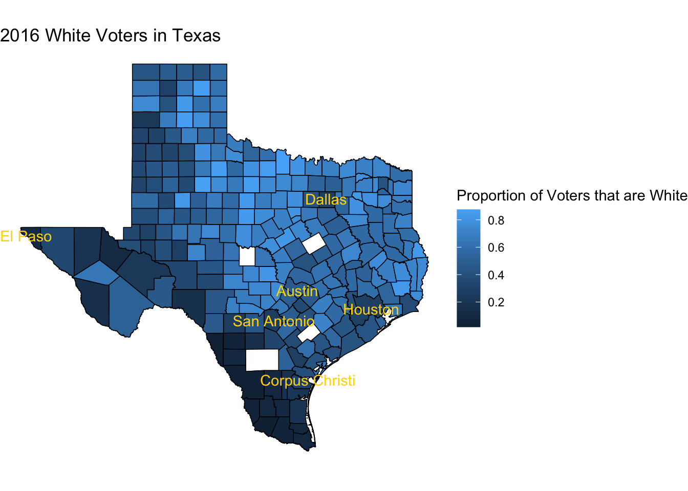
These maps give a very stark representation into where the two predominant race/ethnicities, White and Hispanic, are located in Texas. The further Southwest or closer the counties are to the Mexican border, we see a higher proportion of voters that are Hispanic and the farther Northeast or farther away from the border, we see a higher proportion of white voters. While this may make a lot of sense, I want you to keep this in mind as we look at our next visualization set.
Texas is notoriously bad at getting its registered voters to actually get to the voting booth and is consistently ranked as one of the worst states at getting voters to turnout in national elections. So, in this visualization, we analyzed how far away each county is from the national average of 60% Statista.
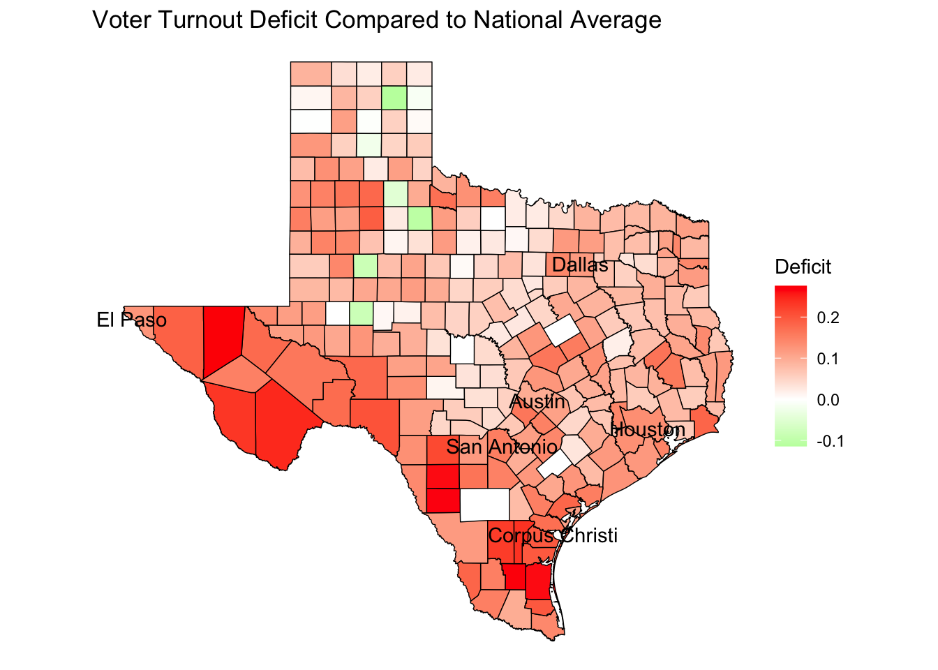
In this visualization, the counties that are in green are above the national average in voter turnout, counties in white at the national average and counties in red are below the national average. Counties that are more red are farther below the national average and the counties that are the most red along the Texas-Mexican border, which has a higher majority of Hispanic voters.